Banner Builder
Adopting, optimizing, semi-automating, and digitalizing marketing campaign banner creation.
Role
Fully responsible of the UX-UI design of the solution.
Timeline
Medio 2020 – early 2021
A short heads up
Since I’m bounded to a nondisclosure agreement, there are no specific client- or team member names mentioned throughout the portfolio and case studies. When names do show, there are additional agreements made with the client/person at hand. Some designs are distorted to meet the agreement.
Sketches, designs and concepts are copyrighted by Linx-IT Solutions bv. All rights reserved.
Thank you for understanding!
Introduction
Semi-automating banner creations
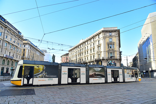
One of our clients commissioned us to develop a tool that could safe them a tremendous amount of time and cost, when creating marketing banners. These marketing banners would be used both in digital form and in print. They also must follow their specific pre-production guidelines.
The challenge
Maintaining high banner quality and quantity
The biggest challenge we faced, was to maintain high quality and quantity, whilst also making the creation of these high-grade banners as automated as possible. Furthermore, the tool had to be time and cost efficient. And lastly, the tool had to have the ability to create all banner sizes stated in their guidelines, plus fit all their varying content.
How it works
Fast and cost efficient
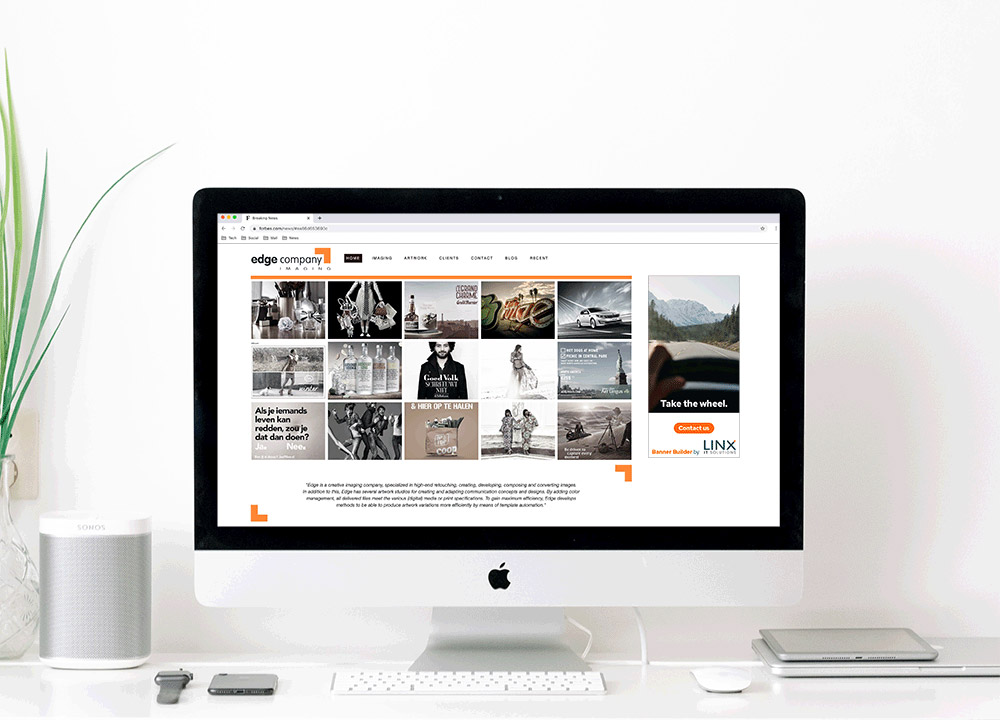
Banner Builder can create multiple banner sizes with the same content, or one size for multiple channels, with multiple content variations. Each campaign/season, content is uploaded, smart templates are defined conform pre-produced guidelines, and channel requirements are created. Once everything is set up, banners can be created by the end users. Dynamically and online.
Who it’s for
Large retail & e-commerce organizations
It was a specific question from one of our clients. However, there was a lot of potential expanding the future solution towards other retail- and e-commerce organizations. This was due to the fact that they have similar paint points and needs. Banner Builder is for those who need to be able to communicate their brand through a range of channels. Each channel has their own requirements, while all content still needs to be included.
My contribution
While working on the project, I was responsible for the overall user experience, interaction concepts, and the visual/user interface design. I translated the problem and needs into a valuable design solution, eliminating the pain points at hand. I observed how meetings developed and retrieved data and information from those meetings. I analyzed it and used it to strengthen the design decisions.
The process
Iterative and incrementally improved
Understand
Actionable problem statement
Direct contact with the client enabled me to understand the context of use better. We figured out that the current banner creation process was focused on either one banner or one channel at a time. The actionable problem statement we identified throughout the kick-off and briefing was as followed:
“How might we produce large quantities of marketing banners that are according to guidelines and channels, while being time efficient and meeting high quality requirements?”
Research, analysis, validation
Excessisve guideline, content, costs and requirements analysis
Since there was little room for good user research, we had to work with the client and our knowledge of the users and process. We discovered that users work on banners in separate InDesign files. This is a repetitive activity, which can interfere with the high quality requirements. We analyzed all the collected information. Four key pain points emerged:
Emerged key pain points
- Large amounts of repetitive tasks
- From one file to the other
- Losing overview due to quantity
- Double check with guideline
Once the pain points were clarified, we did a second massive research and analysis on the guidelines, content, costs and requirements. Figuring out how these elements can play a role in future design decisions. Finally we shared the use- and insightful outcomes with our client. They were delighted with the results.
Ideate
New point of view
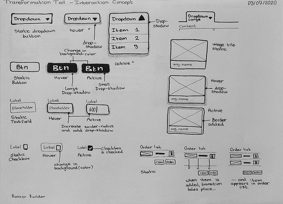
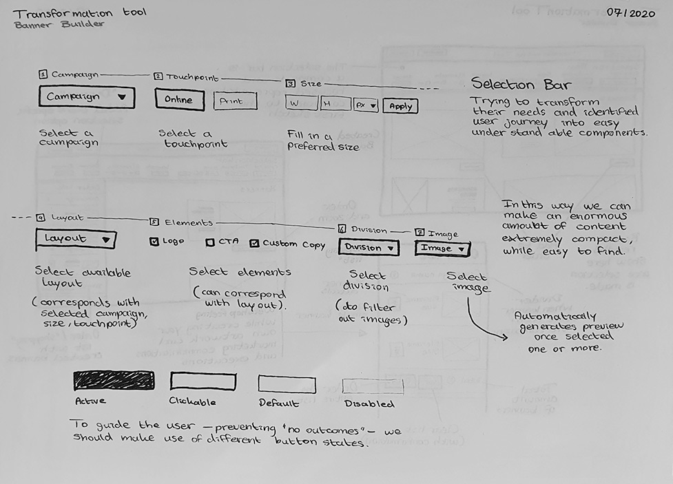
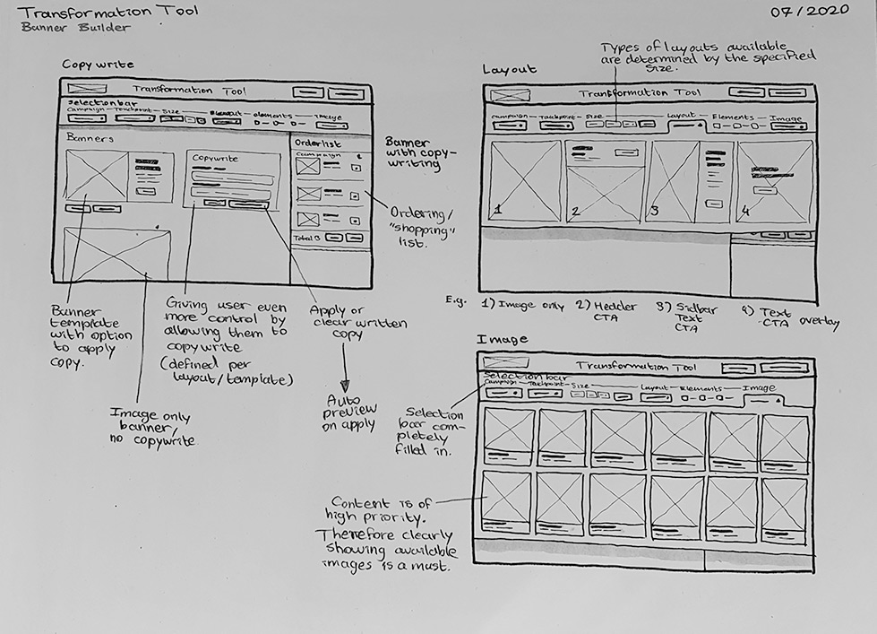
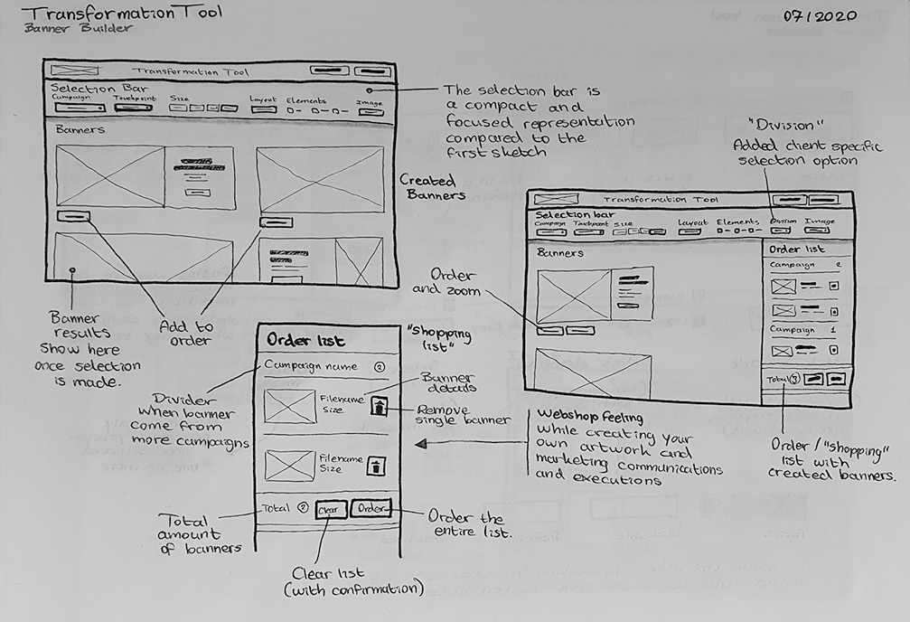
While empathizing with the user in mind, I started iterating on several sketches. This process went back and forth, until a final sketch was chosen. In between all of this, I sat down with the team members, and in order to gain input from different points of view, discussed the collected information and sketches.
Because I was still rather new within the retail, e-commerce and fashion industries, it helped me to better understand what patterns I should take in consideration, from which I could better substantiate my design decisions.
UI and visual design
Client specific while maintaining the UX
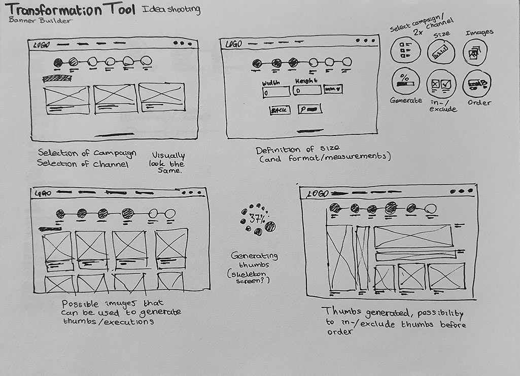
Once everything was discussed and confirmed, we came to the one solution. Since it had to be within the client’s style, while we also aim to solve the pain points, we divided the builder into functionality-sections. We created the core of the builder. And by this practice, no matter the aesthetics, we maintained the determined user experience.
Instant visual design & prototype
We were realized by the fact that most people are visually oriented. So we created detailed wireframes of the main screens involved. They, however, lacked some context since no representative content was shown. We immediately eliminated this issue, by creating a visual design of the 3 user flows that could be taken. This cleared the skies instantly, and we could proceed to the final phases.
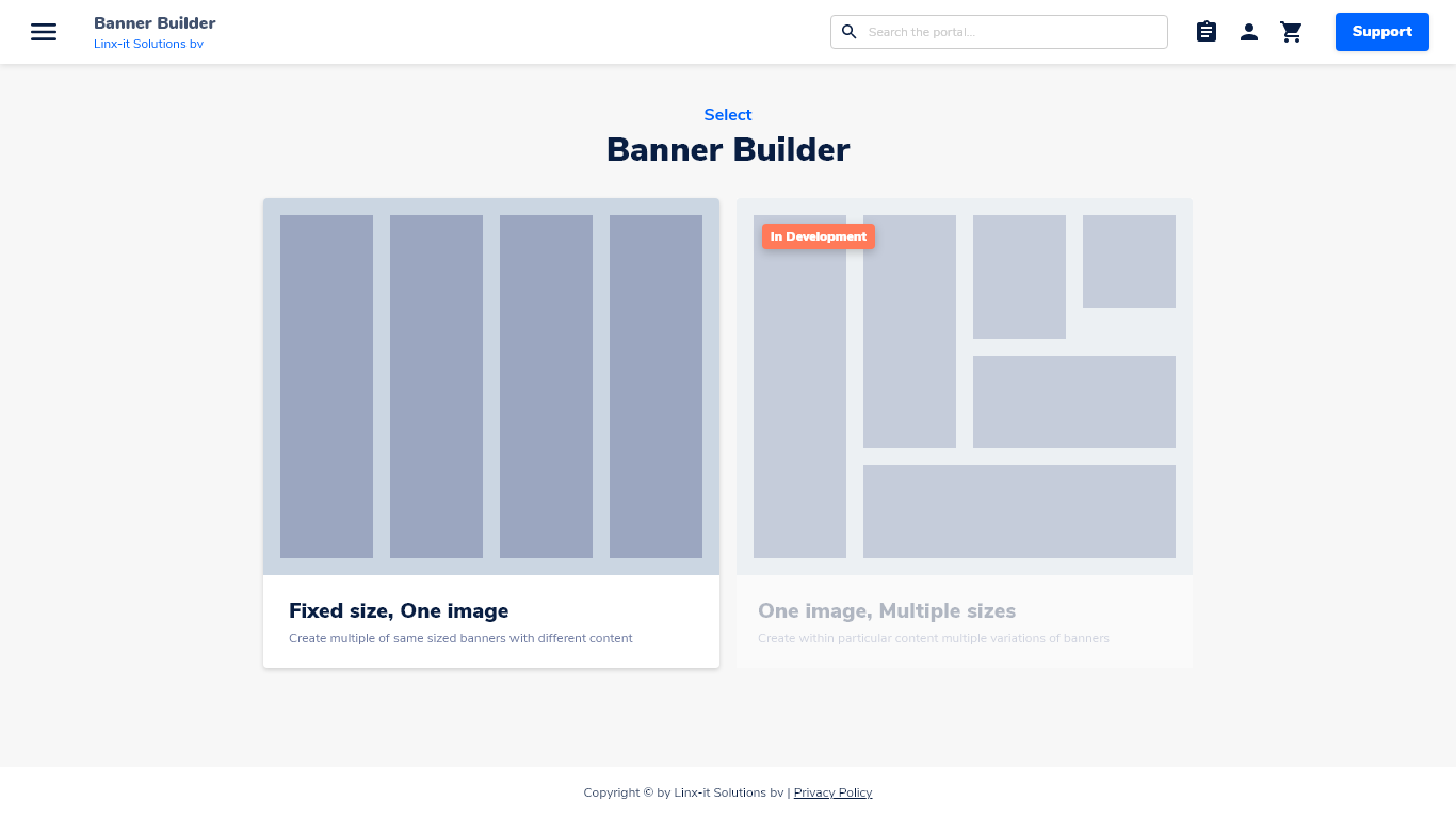
Two approaches
The identified needs were mainly related to either content or size, regarding marketing banners. To ensure we met both needs, we started the creation of banners with a choice of either going for a content, or size focused creation process.
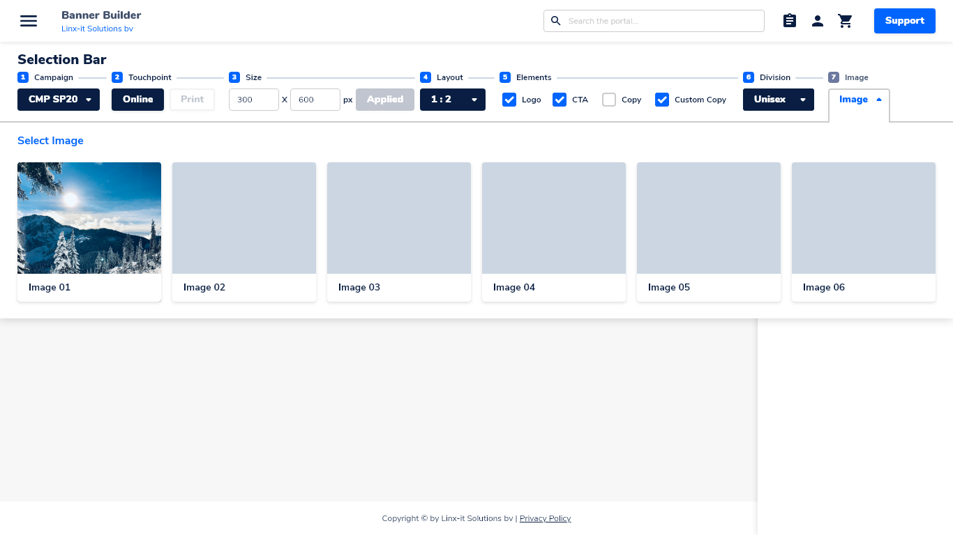
The selection bar
We made the selection bar the prominent feature, since the focus is on the creation of banners without any trouble or setbacks. With disabled, active, hovered, static states, we ensured that the user exactly knows where they are in the creation process.
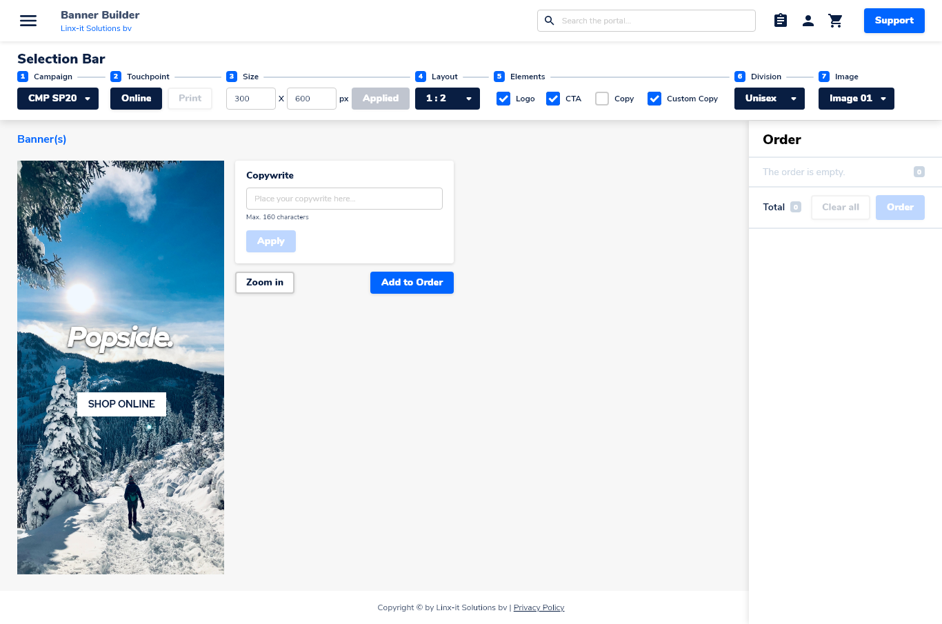
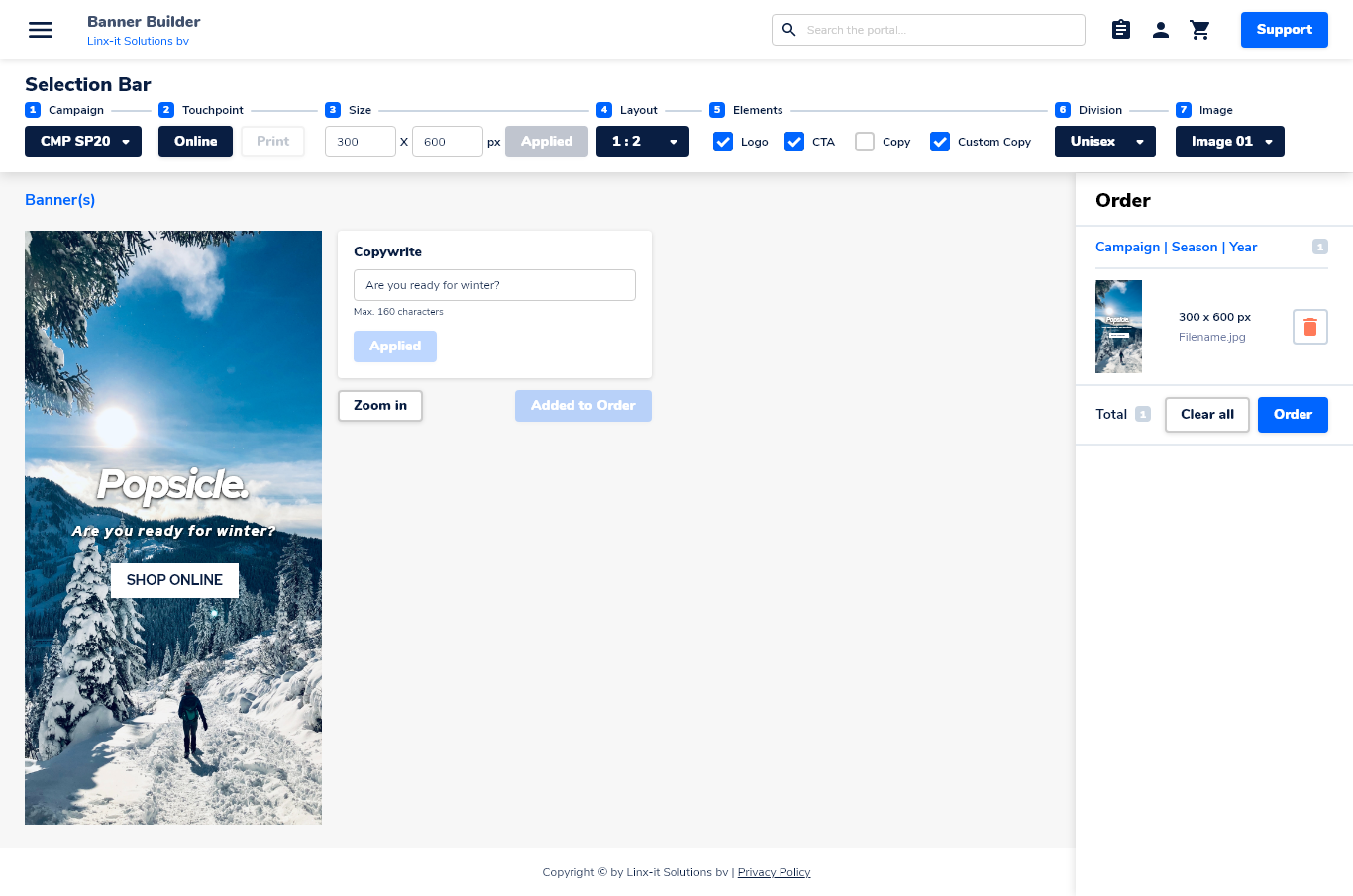
Created banners
Once the user reaches the final stage of the creation process, we lay emphasis on the final outcome. The high quality requirement is the centralized point of attention during this stage.
Order list
With the order list – on the right side of the design – we approached the solution, in a similar way as an online shopping cart pattern. In this way we met the mental model of our users without big changes.
Prototype
Click-modelling and prototype
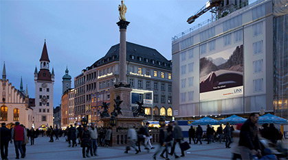
Presentation of the final design is key. Through the use of a well thought out, tested prototype and click-model, we were able to completely show the interactions, user experience, and visual design to both client and team. It visualized the end product in a great way.
And finally, once all of the aspects above were approved, all the designs were received by the development team and the first version of the Banner Builder was launched.
Meet-ups and iterations
Validating assumptions and gaining insights
Throughout the entire process, we kept on meeting up with our client. This was a great way to consistently validate findings and assumptions. Over time, information can be added or changed, new stakeholders can suddenly come into the picture, and interested parties can take a look.
Since all of this happened during the project, we iterated intensively upon the newly gained insights and information. This resulted in a thorough thought out created designed.
What I’ve learned
Reflection
01
My biggest challenge
Humans are thinkers. Therefore, thoughts can change. I had to take on and integrate an adaptive attitude within the process, because of high demands and requirements shifting from A to B, or either defend UX or go-with-the-flow regarding design decisions. This was my biggest challenge during the project.
02
Best lesson
Despite the fact it was a highly complex, technical project beyond the surface, less is more. Thanks to the expertise of the development team, I was able to understand how data was retrieved and used in the front-end. This helped me make informed design decisions and added value to the simplicity and impact of the product.